
It’s my solo project. I led the UX researcher and web analyst of the project for a pet-caring and feeding company. I led efforts to make detailed dashbord for tracking user flow through single site section.
- Collect data about user flow through section
- Built user persona portratit for this section
- Make more clear user goals on the site
- Create crystal clear user funnel through site
For security and confidential reasons, I can’t write information about the company’s name and data. All data collected for this case study was changed and show only tendency, but provided data is not real.
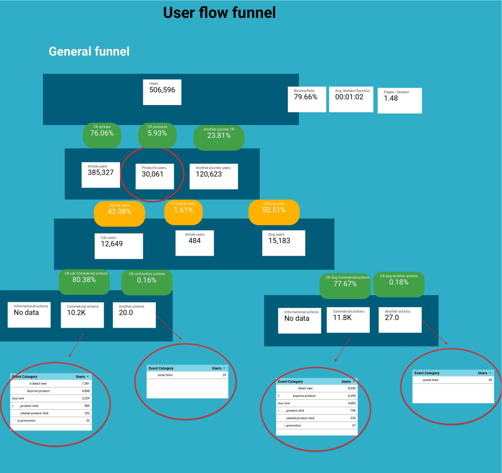
Let’s start right now! The first slide is illustrated the general process on site. It means that the slide showed how user flow went through all site pages and what event performed users on their way. In the first step, all users (506 596 users) landed on the site. It’s the first stage of our funnel. In the second step, we specified the user’s distribution through the content type. Another type of users is people who landed on to contact us page, faq section, etc. Here, we can see that most users landed in the article section. The outsider of this chart is the product section. In the next step, we need to understand what users did and what is conversion rate between stages is. I divided all events on the site into three categories – informational (subscription, use of fun forms, etc), commercial (buy product, product detail view) and other events (contact us, faq, submit compliance form). Here, we have a surprise – the product category generated more events than high-traffic level articles. Let’s investigate how traffic flowed through the feeding section too. Feeding section step I divided to users who landed from cat, dog article section or article section. As we can see the best performed cat owners. They performed 80% of commercial events. What is interesting here – users didn’t subscribe to articles update, it’s 0 informational events. The user landed on the article, read it and left the site. From the user side, it’s reasonable ‘cos the user completed the task and he hasn’t any reason to subscribe.
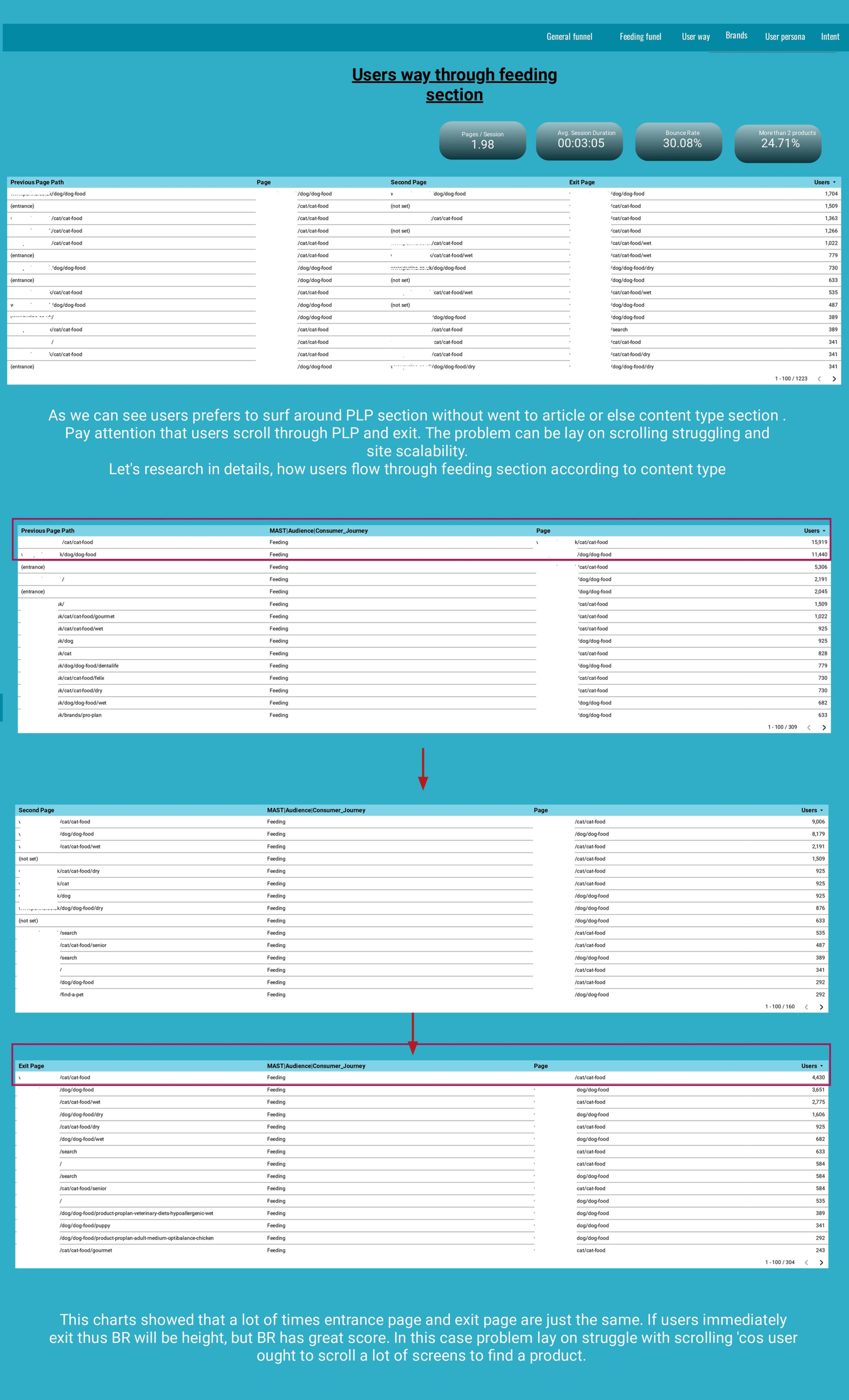
The next slide is dedicated to user flow through the section. It showed us that those visitors exited from the site from 1-2 pages of the journey. The chain of user journey is just the same for huge number of users. Sometimes product listing struggle with vertical scrolling ‘cos the user scrolls up and down a lot to find a product. But the listing is huge, and the user is exhausted to scroll and left the site.
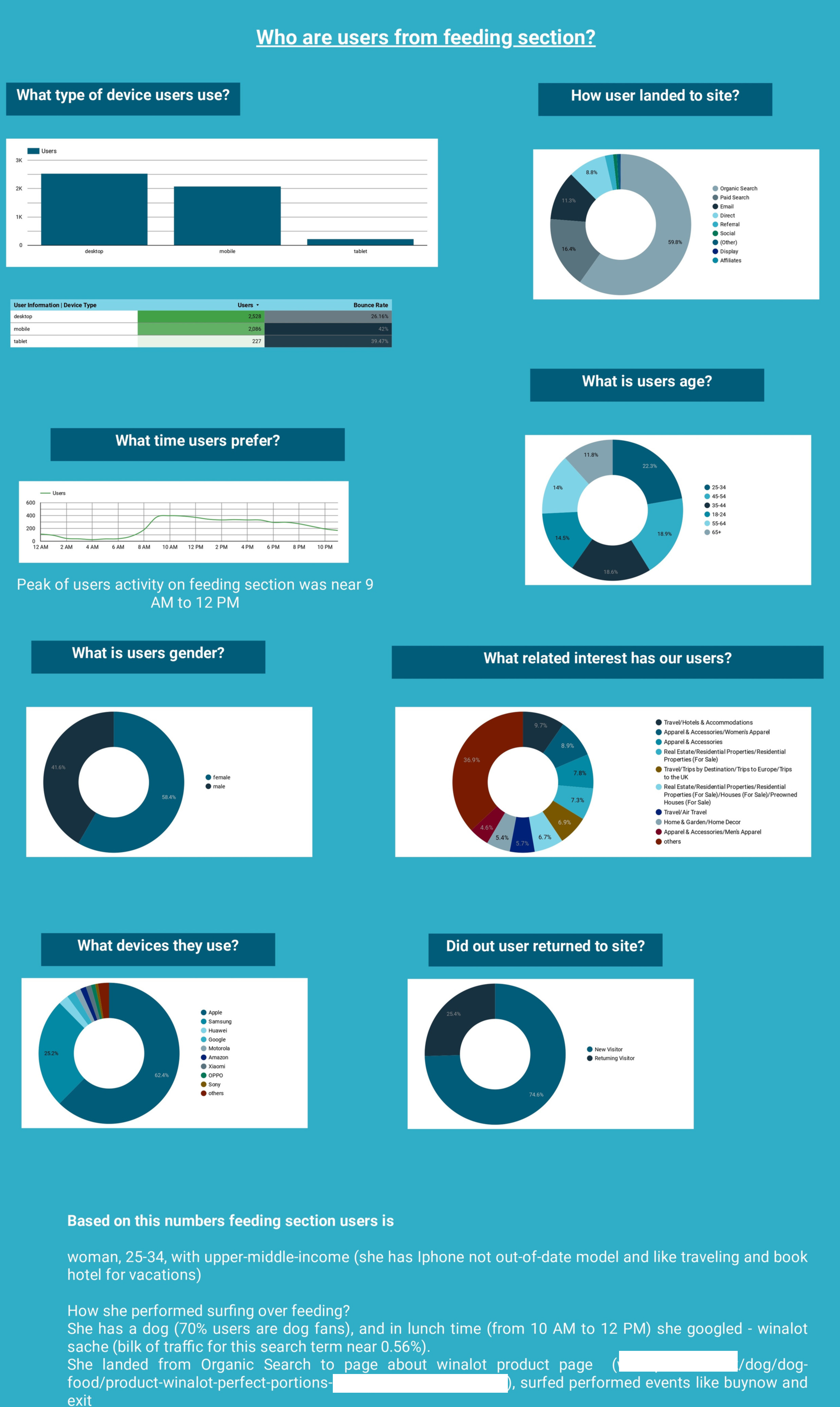
Now, who are those users? What do they like and when they visited the site? The answer is out there. Right on the slide
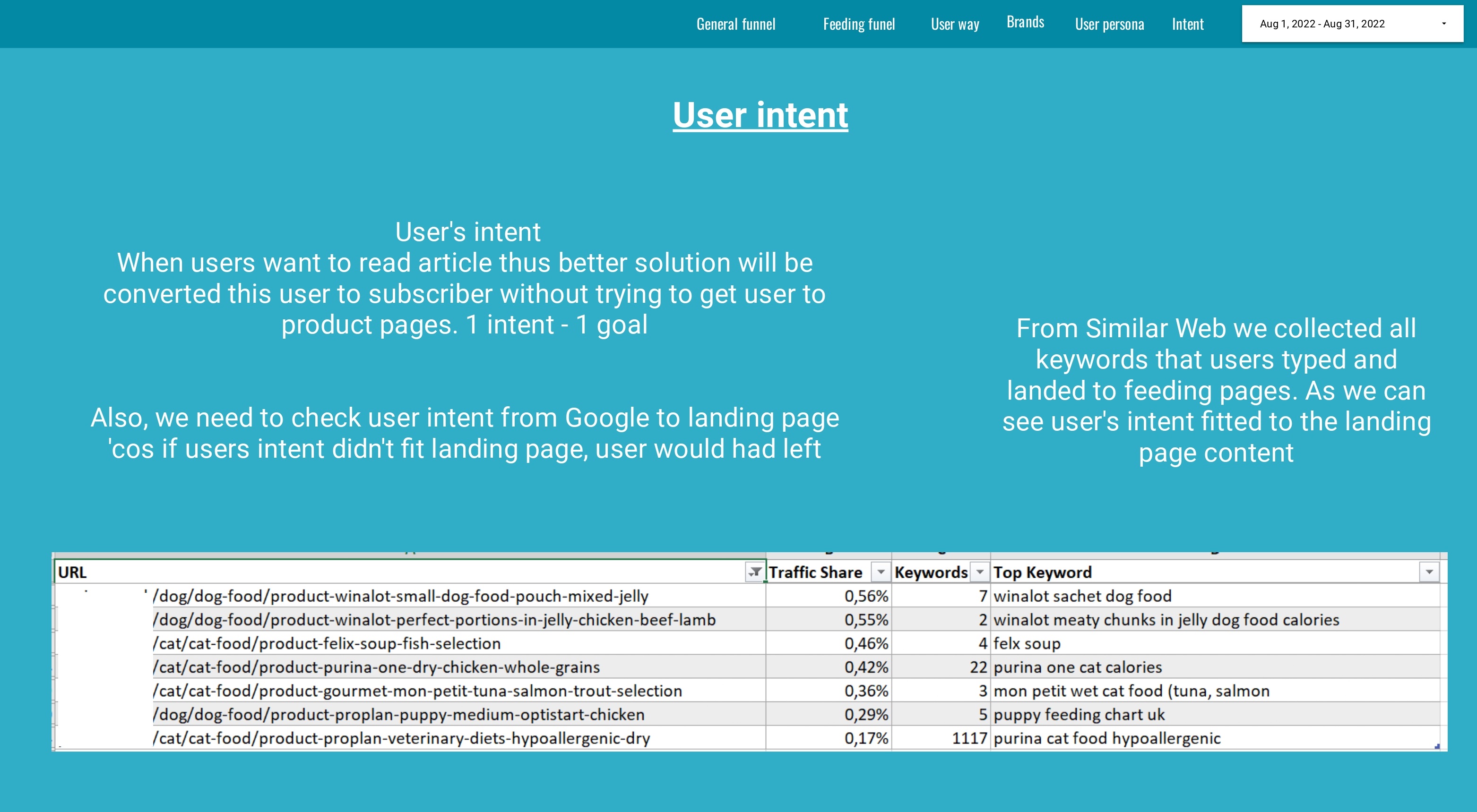
The final slide highlights user intent and satisfaction. Here, I used SimilarWeb and GA to check how user’s intent satisfied the landing page. As we can see the problem is not in SEO or the landing page.
Recommendations:
- Create a hook (I mean reason here) why users after completing their task need to subscribe to your newsletter. Show the user that he or she is important to you, give them additional opportunities to subscribe, and make the registered user special, a person that has privilege.
- Check the layout issue on the feeding section ‘cos high BR and page speed issues could be a reason why it happens.
- Check the user persona portrait and create an empathy map of a user for each stage of the user journey.