
It’s my solo project. I led the UX researcher and web analyst of the project for a pet-caring and feeding company. I led efforts to crystal clear dashbord for tracking user inner search activity.
- Track user flow on the site
- Measure CR for registration and purchase funnels
- Catch main tendancy of Organic traffic fluctuation
The company wants to know how is inner site’s search useful for user. Let’s try to find out it!
For security and confidential reasons, I can’t write information about the company’s name and data. All data collected for this case study was changed and show only tendency, but provided data is not real.
The company need a dashboard that could describe the main tendency of site performance throughout the month. Here, I focused on user behaviour on the site. Detail about the site: the company sells products for pets and has a large section with articles. On product pages company’s team implement event buynow – click on the to Buy button and on the article section subscribe event (together). Other events are additional and characterize only user activity. Pay attention that other event besides buynow and together doesn’t impact to user’s funnel through articles and product sections.
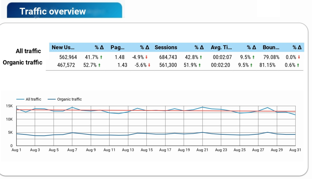
Let’s jump to the dashboard. Section traffic overview is shown how to change the level of traffic during the month and how to change the bulk of organic traffic in this period. As we can see from the board, that traffic has moderately increased and the fluctuation of pages per session is within the normal range.
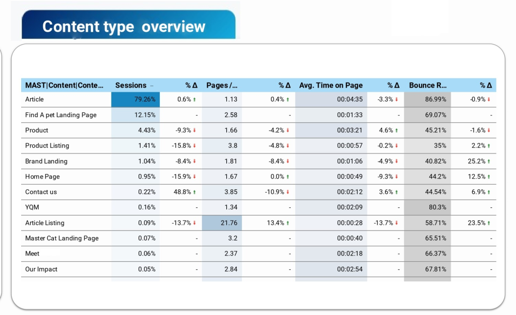
After general research of traffic, let’s dive deeper into how a user interacts with different types of content on the site. The next section shows to us some interesting things like the following: Article Listing – decreasing sessions and session duration on a background of increasing pages per session and BR. What does it mean for us? An article Listing is a list with articles sorted by category and the user on the article listing didn’t spend more time. The user went to Article Listing and after that went to some articles that fit the user’s intent. In this case, the drop on sessions and session duration isn’t so important. The decreasing number of sessions could be caused following reason – users went to the article directly from Google search. To check this hypothesis, the company needs to require additional research of acquiring channels to the article section and more characteristics about the article section. The article section has a large part of traffic, but let’s research it in detail. The user reads articles (session duration nearly 4 minutes), but user’s way is short (nearly 2 pages per session). Why do we have this situation? The answer lay on BR. The company lost their users and high BR (more than 86%) illustrated it. There could be a technical issue (I wrote about it in Page speed report) and user’s intent issue. If the landing page didn’t fit the user, he had gone out from the page (it’s mostly for SEO reasons).
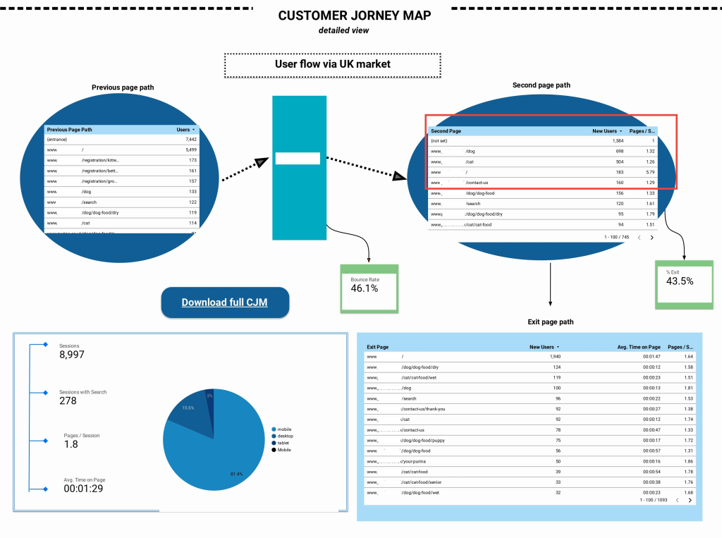
The next section is Customer journey map through the site. Here, I track all user way through the site, first step it’s a table that contained the previous page path. As we can see, most users landed from Google search to the registration section or dog section. After that second user’s step is the way to dog or cat section and Home Page. Here, I highlighted BR and % of exit. Pay attention that these metrics showed different meanings. BR is a metric that described the number of users that immediately exited from the site during first 30 seconds without performing any events. % of exit is a metric that shows how many users exited from a page that was last in the user way. It means that the user went to page read, scroll, etc and after that exit. The exit page table gives us interesting conclusions – the user’s second and first page journeys are just the same as exit pages. It means that users quit from the first page in their journey and proved that the site has a problem with huge BR and all following from this statement problems. The pie chart and indexes near it showed to us channels of user’s engagement and device distribution.
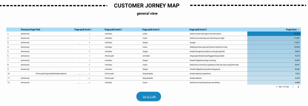
Sometimes, stakeholders have a problem with recognising user way with full URLs, the next section of the report resolves this problem. The following chart illustrated the user’s way through the section on the site without URLs. It’s easier to understand, yeah?
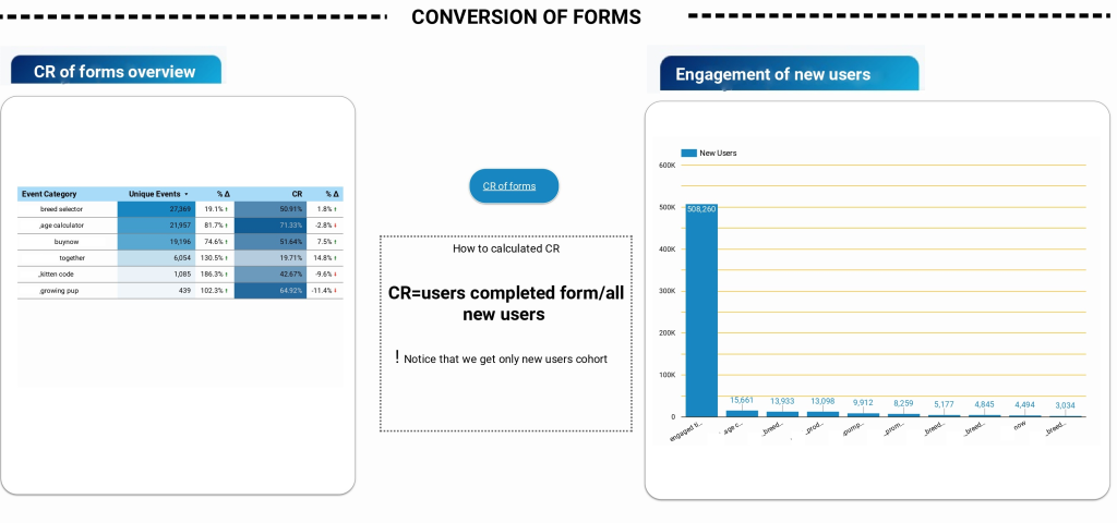
Another interesting part of the report is conversion of the forms. As I mentioned at the top of this article, this site implemented a lot of forms but only two make real conversions. Here, I highlighted the percentage of form conversion and how these events were distributed by user activity. As we can see more popular events are age and breed and more conventional forms are breed selector and age calculator.
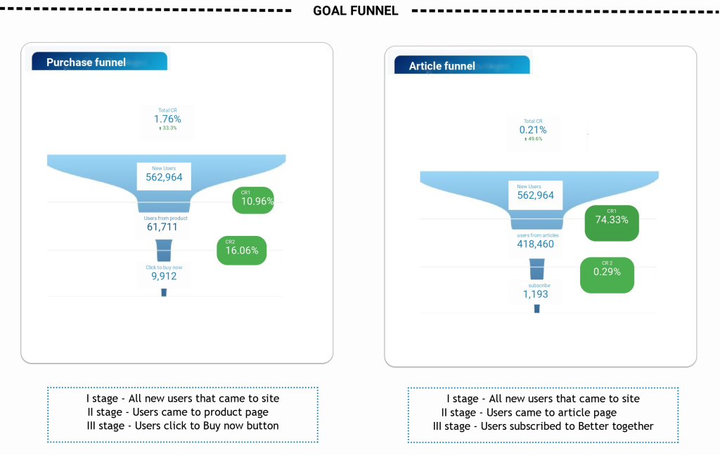
The final section is one of the more “delicious” parts of the report and makes all site’s performance clearer. Here we can see two funnels for the purchaser and reader. As we can see from the product funnel, users from this site prefer more buy than read. Conversion of reader channel is low. It’s alarmed stakeholders and teams that in the article section they need to make some changes and try to make A/B testing.
This dashboard could help stakeholders and product owners understand the main tendency of the site’s performance, highlight problems on site and ways to their solutions.